

2023 Deposits promo landing page Redesign
Overview:
In this project, my goal was to provide Ally Financial's landing page with a fresh and appealing design to attract new customers interested in opening a checking account. My responsibility involved creating a landing page that aligns seamlessly with Ally's updated brand identity, offering clear and direct guidance on the account setup process, and showcasing the associated benefits. Meeting tight deadlines was crucial, as we had just two weeks to complete this project while ensuring professionalism and attention to detail.
Project Objective:
Get new customers to open an Ally Spending Account and set up direct deposit by highlighting our spending account as the most compelling option for their spending and testing a $200 bonus as an additional incentive.
Team Roles:
Lily Ruble: Visual Designer (Intern)
Ryan Krause: UX Designer and Development
Mark Baran: UX Designer for Social Media Ads
Sarah Pryor: Content Design
The User: The Aspirational Saver
Stats: (Age 22-44, 50k+ HHI, $0-250k Net Worth)
ASP audiences are primarily going through life stage changes, such as starting their first job, getting engaged, moving, or other significant events.
They have high earning potential throughout their lives, making it crucial to establish a relationship with them early as they build financial balances over time.
Key subsegments within ASP audiences include:
Primary Switchers: Individuals who switch banks primarily due to life stage changes (e.g., moving or starting a new job) or because they are dissatisfied with their current institution.
Aspirational Savers: More digitally savvy, they follow technology and lifestyle trends and are likely to be cable cord-cutters who prefer streaming services. They have a strong interest in music/entertainment, news, and sitcoms.
Foodies: Significantly more likely than the general population to frequent restaurants and enjoy cooking at home.
Lifelong Learners: Approximately half of Aspirational Savers prioritize ongoing learning in their lives, second only to their interest in music.

User Flow Chart
Design Process
WireFrames
Program: Invision
1. Hero Section Enhancement: Crafted a captivating hero section to concisely convey crucial information, featuring a prominent Call-to-Action (CTA) button that seamlessly guides users to the DAO with the pre-populated promo code.
2. Visual Engagement: Infused visual charm by integrating graphics sourced from Ally's illustration library or custom-designed promo code visuals, tailored specifically for this campaign.
3. Streamlined Navigation: Implemented an intuitive sticky navigation element, ensuring users can effortlessly access essential information, regardless of their position on the page.
4. Persistent CTA: Extended the CTA's accessibility by including it in the sticky navigation, granting users the convenience of reaching the sign-up page at any juncture.
5. Focused Information Hierarchy: Reordered content to prioritize the "How to get your bonus" section right after the hero, segmenting it into clear, concise steps for enhanced comprehension.
6. Brand Promotion: Introduced accolades to underscore Ally's brand strength before delving into the finer nuances of why Ally's spending account stands as an optimal choice.
7. Benefits Clarity: Structured perks content within distinct boxes, creating a well-organized benefits section for easy absorption.
8. User-Centric Checkmarks: Employed checkmarks to emphasize user-desired features within the checking account, making it effortless for users to identify their preferences.
9. Information Digestibility: Enhanced information layout for setting up an account, employing bullet points with generous spacing between them, facilitating distinctiveness and ease of retention.
10. Comprehensive Support: Thoughtfully positioned Frequently Asked Questions (FAQs) at the bottom, ensuring users have access to standard queries after a thorough read-through, accompanied by necessary company disclosures in the footer to ensure legal compliance.


PrototypEs
Program: Sketch
To transform these wireframes into static prototypes using the Sketch program, I followed a structured process:
Wireframe Importation: Initially, I imported the wireframes, which served as the foundation for the prototype, into the Sketch program.
Clickable Elements: Identified key interactive elements within the wireframes, such as buttons, navigation menus, and CTA elements.
Creating Artboards: Created artboards for the mobile and desktop versions of the prototype, mirroring the wireframes' structure.
Sticky Navigation: Implemented the sticky navigation, ensuring it is clear to the developers that it’s intended to be visible while the user scrolls throughout the page.
By using the Sketch program, I was able to efficiently transition from static wireframes to a concise prototype that closely resembled the intended user experience, allowing for a more comprehensive showcase of the design concept.

Visual Design: Key Elements
Inspiration: My design draws inspiration from the social media advertisements that direct users to the landing page. It utilizes their vibrant gradients, color schemes, and graphics to create an engaging and visually appealing experience.
Color Palette: I harnessed Ally's primary brand colors - plum, blueberry, and champagne - to infuse fun and visual charm. Additionally, I introduced secondary colors like seafoam green to highlight crucial information, such as the promo code, instantly.
Typography: Adhering to brand guidelines, I employed the Poppins regular and bold typefaces to establish hierarchy. Key details, such as promo codes, deadlines, necessary account information, and summarized perks, were accentuated with a bold weight for emphasis.
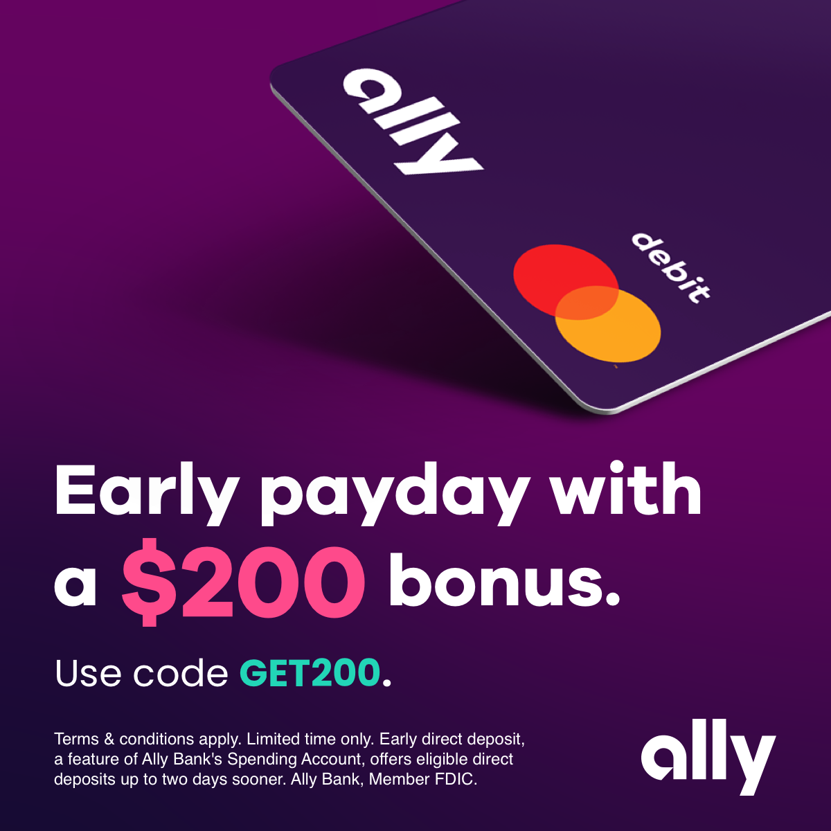
Graphics and Illustrations: To maintain a lively design, I carefully selected Ally brand illustrations that harmonized with the content, adhering to illustration guidelines tailored for various web applications. These choices were driven by their intention, whether primary or secondary, and conformed to specific specifications based on their category. Additionally, to meet legal and compliance requirements, I integrated a graphic of an Ally Debit MasterCard in the hero section, showcasing the tangible product accompanying the customer's new account upon signup.

(Social Media Advertisements designed by Mark Baran)

Accessibility
Ensuring Accessibility and User-Friendly Design: To guarantee accessibility compliance, I meticulously reviewed each color combination using the WCAG Color Contrast Checker, ensuring that text remained easily discernible against its background.
Consistency and Readability: I maintained a consistent font size for sub-copy across both desktop and mobile platforms, adhering to a minimum of 16px to ensure optimal readability for all users.
Enhancing Readability: I paid special attention to paragraph formatting, ensuring that paragraph lines did not exceed four lines of text and maintained an appropriate paragraph width. This approach was aimed at facilitating an effortless reading experience for users.
Intuitive Navigation: Incorporating a sticky navigation element significantly improved user accessibility throughout their journey. Each section is clearly delineated in the navigation menu, empowering users to navigate effortlessly and maintain context. Furthermore, the sticky navigation's Call-to-Action (CTA) button streamlined access to the desired DAO, enhancing user ease of use and efficiency.

Click the computer to view the live website
Conclusion
Lessons Learned
Wireframing for User-Centric Design: During the wireframing phase, I grasped the importance of maintaining a big-picture perspective, focusing on crafting a well-structured layout with distinct sections that allowed users to swiftly access the information required to establish their accounts. I discovered the significance of not getting bogged down by minute details initially, instead opting for an overarching content layout that prioritizes a user-friendly experience.
Dynamic Prototyping and Design Adaptations: The prototyping stage illuminated the dynamic nature of design, as feedback and evolving requests from the marketing and legal teams prompted substantial design adjustments. Balancing design coherence between mobile and desktop platforms was an engaging challenge, necessitating consistent font and graphic sizing. Simultaneously, I remained attuned to the constraints presented by the Adobe Experience Manager (AEM) platform throughout the design process.
Web-Specific Brand Standards and Accessibility Guidelines: As a returning Ally intern, I delved deeper into the brand standards specific to web pages, encompassing illustration specifications, web colors, and mobile development nuances. Furthermore, I expanded my expertise in web accessibility guidelines, gaining a deeper understanding of their application in the digital realm.
In hindsight, my initial landing page project served as an invaluable learning experience and allowed me to further refine my knowledge and skills in the field of UX design, reinforcing my commitment to creating user-centric and accessible digital experiences.